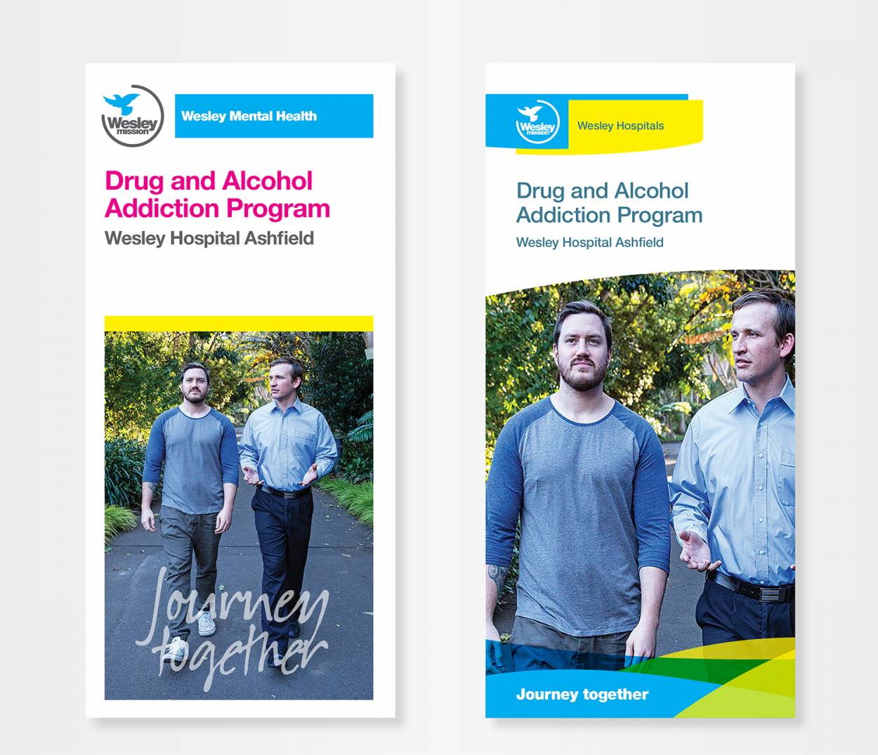
Elements … what was required?
Brand redesign, marketing communications, business stationery and identity guidelines.
Background … what was the issue?
Wesley Mission is a Christian charity working with the homeless and disadvantaged across NSW. They had created a new brand identity system. However, it didn’t work. It was overly complicated, had too many colour options and a convoluted hierarchy of colour ways to represent their service areas. Wesley’s use of cyan as their corporate colour had also been lost in their malaise of colour ways. They had also created a fixed and unimaginative design for their print communications.
Brief … what needed to be done?
Essentially, the brief was to fix the recent re-branding. In a little more detail it was to create a clean structure of communications for the service areas and products within, and restore cyan as Wesley Missions’ brand colour.
Creative response … what did I do?
Reduce the number of service tiers. Remove the complicated colour ways and delete the tertiary colour palette. Create a more tangible and positive link between the service area and its colour.
Create a fluid identity that allowed designers to ‘top and tail’ each communication piece with cyan, restoring it as Wesley’s dominant colour.


